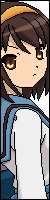
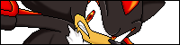
Darkflare Posted March 27, 2014 Posted March 27, 2014 https://1drv.ms/f/s!AMeQh1efhdedgSI So last time I edited a character it was an fan-made evil version of a touhou character. The logical thing to do clearly is to do it again(sans the evil part as Meimu isn't evil.) Meimu is basically a non-charge version of Ricepigeon's Reimu. Properties were changed in the moves to reflect this(as in, Meimu doesn't recover as fast from throwing an amulet.). Additionally, she does have a few moves of her own that Reimu doesn't have as well as lacking certain moves that Reimu does have making her play significantly different from her original counterpart. Dumanios 1
LightFlare_Da_Realest Posted March 27, 2014 Posted March 27, 2014 Well, well. Darkflare decides to annoint us with a creation of his own...somewhat. With you vast character knowledge I'd say this might be worth checking out. I'm usually a stage guy...but I'll DEFINITELY make an exception. I AM digging the pallette at least. Now to check out the gameplay... Thrillo and Legendary DeMoNk@I 2 Do your best to become stronger. Become stronger, so you can do your best
JokerintheButt Posted March 27, 2014 Posted March 27, 2014 Well, well. Darkflare decides to annoint us with a creation of his own...somewhat. With you vast character knowledge I'd say this might be worth checking out. I'm usually a stage guy...but I'll DEFINITELY make an exception. I AM digging the pallette at least. Now to check out the gameplay... indeed this is the must important edited mugen character of darkflare so i will check that out. My Signature Fuck U :D I Don't Have one Asshole.
LightFlare_Da_Realest Posted March 28, 2014 Posted March 28, 2014 Not bad. Pretty basic but she's equipped enough to take on most fighters. It is what it is. As far as inspecting the .sff, clns, hit boxes and all that jazz...im not the man for the job. Do your best to become stronger. Become stronger, so you can do your best
Darkflare Posted March 28, 2014 Author Posted March 28, 2014 Dunno what inspecting the .sff file would do, but hitboxes are easy to figure out. Do they properly cover the character? Do they make sense? Do they work for the attack's intended property?
LightFlare_Da_Realest Posted March 28, 2014 Posted March 28, 2014 Dunno what inspecting the .sff file would do, but hitboxes are easy to figure out. Do they properly cover the character? Do they make sense? Do they work for the attack's intended property? I feel ya... Do your best to become stronger. Become stronger, so you can do your best
Kazagami Posted March 28, 2014 Posted March 28, 2014 Will you add Yukari-ish moveset to her, in the future update? Just wondering. WaifuLaifu Discord Server / Twitter / MUGEN releases
Legendary DeMoNk@I Posted March 28, 2014 Posted March 28, 2014 Im not into these kind of characters so game play wasnt my concern on whats super decent or not BUT ive seen a lot of collision boxes inconsistent looking. Or odd i should say -why green and blue boxes? why not just use the common blue boxes? eh personally i never use green anyway -Anyway the character is pretty small as it is but it can still use more than one clsn box in certain areas for the head and body as it should so she can get hit easier. here are image examples on what i saw that looked odd as hell to me in the AIR section There should be at least two boxes. for the head and body from how she looks These look bad on the Jump animation. the Clsns are not properly set entirely -im not familiar with the games these characters come from so i cant judge too much on everything. So if there was accuracy going on on purpose you or Rice did in certain areas i wouldnt know. But most if not all the sprites have just one box on them for most of the basic movements where its just on a portion of the body and not on the head and the body where it should be. Thats my opinion on that. Heres more This here i felt was way too big for a wand hit box as skinny as it is especially for a normal jumping medium attack It should look bit more like this here for example: Even for this normal heavy axe kick state 220. why does this kick have a dino size Red hit box there? looks pretty cheap that way. shes skinny as hell. doesnt look right in game with the CLSN viewer on or in the Air begin state action either. If her legs are this skinny in the game Then why are the hit boxes THAT big? The hit box shouldnt be that huge. looks retarded. should be closer to the legs. If you have to get close to use that kick it makes sense to do so and not just cheat for reach This i think could have been a bit longer to the tip of the wand. The enemy is supposed to be poked with the start of the tip of the wand right? looks odd to me how that hit box is: And lastly, why are The CLSNS missing from the top of the character in parts of the Ascension kick? doesnt look right Well theres more but those are things that bugged me the most when i downloaded the character and reviewed the CLSNs when i checked. Thats my feedback on this character Thrillo 1 Never limit your imagination as a Visionary
Darkflare Posted March 28, 2014 Author Posted March 28, 2014 Will you add Yukari-ish moveset to her, in the future update? Just wondering. Yea, already looking at Yukari moves to add. I'm considering having her teleport resemble Yukari's for starters(Looks wise at least). I doubt I'll include any of her specials(None of Yukari's specials complement Meimu or they make her too effective), but I'll probably have Meimu use some of her supers(Meimu Express? Ah, but the train should be something else for Meimu if I use that.). Im not into these kind of characters so game play wasnt my concern on whats super decent or not BUT ive seen a lot of collision boxes inconsistent looking. Or odd i should say -why green and blue boxes? why not just use the common blue boxes? eh personally i never use green anyway Green(and yellow) are used or situations where the hitbox will remain the same in the same animation anyway. They work exactly the same as Blue and Red CLSN(and will look like so in-Mugen when viewing collisions) -Anyway the character is pretty small as it is but it can still use more than one clsn box in certain areas for the head and body as it should so she can get hit easier. Which moments exactly? Would help if you let me know exactly. here are image examples on what i saw that looked odd as hell to me in the AIR section There should be at least two boxes. for the head and body from how she looks These are her dashes, right? Actually, these are correct. Dashes generally keep a hitbox like this during them even though the sprite might seem otherwise. These look bad on the Jump animation. the Clsns are not properly set entirely Jumps are tricky, but for jump back and forward these are correct as well. Heres more This here i felt was way too big for a wand hit box as skinny as it is especially for a normal jumping medium attack It should look bit more like this here for example: It's intentional for functionality purposes. If I reduced it, it would lose it's effectiveness. Even for this normal heavy axe kick state 220. why does this kick have a dino size Red hit box there? looks pretty cheap that way. shes skinny as hell. doesnt look right in game with the CLSN viewer on or in the Air begin state action either. If her legs are this skinny in the game Then why are the hit boxes THAT big? The hit box shouldnt be that huge. looks retarded. should be closer to the legs. If you have to get close to use that kick it makes sense to do so and not just cheat for reach 2 Reasons: 1. Functionality 2. Hitbox covers the leg swing part as well(See the sprite frame before that one) This i think could have been a bit longer to the tip of the wand. The enemy is supposed to be poked with the start of the tip of the wand right? looks odd to me how that hit box is: I suppose I could. It's not wrong as is, except the hurtbox. DEFINITELY need to extend her hurtbox a bit. In fact, I'll go do that right now before I forget. And lastly, why are The CLSNS missing from the top of the character in parts of the Ascension kick? doesnt look right For the first pic, that's still during her invicibility frames, so you can't hit her anyway no matter what her hitbox is. For the second one, she's lowered just enough to get away with upper body invicibility. Yea, do let me know of anything else and I'll look into it.
Zemilia Posted March 28, 2014 Posted March 28, 2014 Tested Meimu as of now. So far, only problem I have (and it's a minor one.. palette issue) is that the portrait on her eyes doesn't look right. But that's all. However, I like to clarify a few things on DemonKai's post on the Hitboxes he had some problems with: -why green and blue boxes? why not just use the common blue boxes? eh personally i never use green anyway I think you're looking at it in the animations section in Fighter Factory. Last I checked in Mugen itself, they are blue. Idk why it shows "green" in the animation section, though. This here i felt was way too big for a wand hit box as skinny as it is especially for a normal jumping medium attack Don't know the best way to explain it: but it's actually because there's some kind of "magic" effect going on in-game. And I meant that as in "a small amulet-looking effect appears during that attack". And one more: And lastly, why are The CLSNS missing from the top of the character in parts of the Ascension kick? doesnt look right If it happens on startup, it's actually just a small invincibility frame going on in there. It's usually good for a wake-up situation. (KI had something like that with Jago's Tiger Fury). That's all I can say on my part. I'll let you know if I find something off. Also damn you DF; You replied to DemonKai's post while I was typing this.
Darkflare Posted March 28, 2014 Author Posted March 28, 2014 Small or large portrait? I had to fiddle with the large portrait somewhat, but I never touched the eyes in that. In the case of small...well...Rice originally went the "Use a sprite as a portrait because laziness" route.
Zemilia Posted March 28, 2014 Posted March 28, 2014 Small portrait. The left (her left) of the eyes looks like it's all red instead of white (Makes her looks like she has pink eyes).
Darkflare Posted March 28, 2014 Author Posted March 28, 2014 Yea, it's one of her sprites anyway, so there's nothing I can really do about it.
Zemilia Posted March 28, 2014 Posted March 28, 2014 No worries. Though it's actually an easy fix. I noticed that "Normal Reimu" is hidden inside one of the "palettes" in Fighter factory 3, so use that as some kind of reference.
RicePigeon Posted March 28, 2014 Posted March 28, 2014 Seeing as DF kept most of the hitboxes intact from the original, allow me to compare them to the source material that I used: This here i felt was way too big for a wand hit box as skinny as it is especially for a normal jumping medium attack Original hitbox: Then why are the hit boxes THAT big? The hit box shouldnt be that huge. looks retarded. should be closer to the legs. If you have to get close to use that kick it makes sense to do so and not just cheat for reach And lastly, why are The CLSNS missing from the top of the character in parts of the Ascension kick? doesnt look right
Arya Chan ☆ Posted March 28, 2014 Posted March 28, 2014 now the sprites finally looks like the ''''Artwork'''' Youtoba (Youtube)(Other Links in There) Facebook (Warning)
Darkflare Posted March 28, 2014 Author Posted March 28, 2014 No worries. Though it's actually an easy fix. I noticed that "Normal Reimu" is hidden inside one of the "palettes" in Fighter factory 3, so use that as some kind of reference. I looked at it again and it's a pallete goof up I made. Yea, I can fix that no problem,
Legendary DeMoNk@I Posted March 28, 2014 Posted March 28, 2014 Green(and yellow) are used or situations where the hitbox will remain the same in the same animation anyway. They work exactly the same as Blue and Red CLSN(and will look like so in-Mugen when viewing collisions) Im already aware the green does the same as blue. im just used to seeing (along with myself) creators using mostly blue Clsn boxes and not both with green and yellow like that Which moments exactly? Would help if you let me know exactly. I showed you a couple already. i just didnt go crazy posting pics. but in general its her basic animations more so i thought looked odd. not fully covering the body as far as the head from the top and sides etc. like the one for the dash and the jump? i never seen a character (i studied) done like that even with dash. just looked off and incomplete but i guess its a Touhou character thing These are her dashes, right? Actually, these are correct. Dashes generally keep a hitbox like this during them even though the sprite might seem otherwise. eh can be debated, but it depends on the character and the author i guess. it still feel those boxes can go around the head and body entirely just right. Jumps are tricky, but for jump back and forward these are correct as well. I assume you mean correct for "this" character series then? I never seen just one box on characters like that with jump. she has a good amount of body space to be covered. she still looks like she would be missed a lot when just jumping in. way too naked. But i wont argue with that. ill take it thats the style of how these kind of characters work. I never see that in for example SNK or Capcom characters and other fighting game characters which im more into. It's intentional for functionality purposes. If I reduced it, it would lose it's effectiveness. 2 Reasons: 1. Functionality 2. Hitbox covers the leg swing part as well(See the sprite frame before that one) It shouldn't lose function at all if the user knows how to play with the character and can get close enough. she has a long wand already for reach. A kick like that which ive used a good amount of times before making that statement still looks like any normal kick. if energy was coming from the kick i could understand but it doesnt. its just a kick! again no debates here. thats just how i saw it. theres a lot of characters for mugen so i assume in this design huge hit boxes for these kinds of small characters make sense then. i dont know For the first pic, that's still during her invicibility frames, so you can't hit her anyway no matter what her hitbox is. For the second one, she's lowered just enough to get away with upper body invicibility. So you have a nohit time code protecting her then? as in, "the code that lets her stay invincible for certain period of time?" You can still have frames in the right places on that kind of attack while having the code on you know. but anyway i understand its the build of this kind of character and its different from others i more so deal with so thats why it all looks odd to me....im used to seeing Clsn boxes on areas its needed and not so open like that For Zemilla: I think you're looking at it in the animations section in Fighter Factory. Last I checked in Mugen itself, they are blue. Idk why it shows "green" in the animation section, though. yep of course, thats exactly where i was at. I was there on purpose looking his stuff over in that area and ingame with the Clsn Viewer on. some creators use green & yellow boxes but not much. its more so blue and red. its more open to see better to select in FFU. i was just saying why not just use all green or just blue? i was picking his brain on that. few creators use mainly yellow and green while most like pots and others like that use Blue and red and minimum green and yellow. I myself never use green and yellow. strictly blue and red. Don't know the best way to explain it: but it's actually because there's some kind of "magic" effect going on in-game. And I meant that as in "a small amulet-looking effect appears during that attack". Point taken. Still though that could have been done better. Put more of that hit box attached to the card itself as shown by Ricepigeons source pic here. This makes more sense to me If it happens on startup, it's actually just a small invincibility frame going on in there. It's usually good for a wake-up situation. (KI had something like that with Jago's Tiger Fury). Trust me i get that but i was trying to make a point. you can still add boxes to that area. if you dont want the character to get hit you can always use this code here too [state 0, 1] type = NotHitBy trigger1 = Time = 0 value = SCA time = 55;<----and adjust it to how long or short you want those frames of animations to be (just an example of one nohitby code) A lot of creators do things for certain reasons and for certain tastes so things look odd to others who dont understand. You could go by the source or whats supposed to be "mugen standard" or your style. Boxes on most parts of the character and just add codes that do the rest of the job. Your character can be unhittable from a code or just not having boxes on the frames at all.....but anyway i understand what im looking at. these Touhou characters are built a certain way in the source game and for mugen. from what im seeing now. Thanks for backing up Darkflare btw..It shows support. But i was confident he could handle his own answers though. Lastly, @Ricepigeon: All those pics look like source game stuff compared to the character created for mugen. Good you showed the source on whats going on and HOW the character boxes possibly should be instead. Im not a fan of those kind of characters but i got educated on the build of those characters when it comes to Clsn and hit boxes i see..... Keep the character updates going (thats needed) for the fans folks laters.... Thrillo 1 Never limit your imagination as a Visionary
Darkflare Posted March 28, 2014 Author Posted March 28, 2014 I showed you a couple already. i just didnt go crazy posting pics. but in general its her basic animations more so i thought looked odd. not fully covering the body as far as the head from the top and sides etc. like the one for the dash and the jump? i never seen a character (i studied) done like that even with dash. just looked off and incomplete but i guess its touhou character thing eh can be debated, but it depends on the character and the author i guess. it still feel those boxes can go around the head and body entirely just right. I do understand where you're coming from and I used to believe that too. But I then found out about this correct method. These kinds of things are something you usually see in fighters where air dashing is available. I assume you mean correct for "this" character series then? I never seen just one box on characters like that with jump. she has a good amount of body space to be covered. she still looks like she would be missed a lot when just jumping in. way too naked. But i wont argue with that. ill take it thats the style of how these kind of characters work. I never see that in for example SNK or Capcom characters and other fighting game characters which im more into. I meant in general. Take a close look at jump back/forward hitboxes and you'll notice they share a similar "shape". If I extend that hurtbox, she won't able to jump forward/back effectively since she will be too easy to hit when she does that. It shouldn't lose function at all if the user knows how to play with the character and can get close enough. she has a long wand already for reach. A kick like that which ive used a good amount of times before making that statement still looks like any normal kick. if energy was coming from the kick i could understand but it doesnt. its just a kick! again no debates here. thats just how i saw it. theres a lot of characters for mugen so i assume in this design huge hit boxes for these kind of small characters make sense then. i dont know if I reduce the hitbox, it loses effectiveness. She would have to be too close where it becomes too risky and you have better moves to use instead. The slight extention also helps with another property that move has. It's viable for cross-ups. The hitboxes aren't unfairly extended. It's not realistic, but it is functional and functionality takes priority over realism in hitboxes. So you have a nohit time code protecting her then? as in, "the code that lets her stay invincible for certain period of time?" You can still have frames in the right places on that kind of attack while having the code on you know. but anyway i understand its the build of this kind of character and its different from others i more so deal with so thats why it all looks odd to me....im used to seeing Clsn boxes on areas its needed and not so open like that It's a DP, it's supposed to have startup invicibility. The nohitby is coded in. And the hitbox works fine for what it's supposed to do. Should also mention that since I'm using Rice's style anyway, there are some creative liberties(while still keeping her fair and balanced, mind you) here and there because if she used the source's system, you would hate her....a lot.
Legendary DeMoNk@I Posted March 28, 2014 Posted March 28, 2014 @ DF: Great. Understood. Trust me i was already alert that this character was close to what rice had intact and the source a bit i assume. you explained what i wanted to see. You cleared up a lot in ways you may not have realized as far building a character yourself or this particular kind of character. Im way ahead of your reason of why things were done a certain way but i just wanted to understand & see why you did it those ways from your side... But as for the dashes. every character isnt the same for mugen in size and in frames used is my point with that. Your character is small right? so you felt one box is needed for that type of character. where as maybe CVS or even MVC characters for example have more or larger frames for a air dash or ground dash. it has to cover the body properly. when i looked at that char of yours it still looked too bare to me even for her size. i re added the frames around her myself to see whats up and it looked fine with two to me nice n snug. but again i understand your judgement. That was your idea and the games (maybe) source on how to put boxes on that kind of dash animations for those kind of characters. Its good to know how certain creators build characters for mugen and how source games differ from others. interesting food for thought though for everyone Anyway good luck on the characters. I dont have any more to say really Never limit your imagination as a Visionary
Darkflare Posted March 28, 2014 Author Posted March 28, 2014 Just as long as I was clear in my reasoning. I don't mind being questioned, in fact I expect it. And not just because I'm such a hardass on feedback and just gave an opportunity for others to do it to me. I've already said it before and I'll say it again. If you don't understand something, ask the author why it is. It's just as good as feedback, hell...it kinda is the same thing.
Legendary DeMoNk@I Posted March 28, 2014 Posted March 28, 2014 Hell, I would hope you like being questioned. thats the best way to start feedback. The purpose was for a few reasons. to maybe point out some things that can possibly be wrong that you may have to fix and didn't notice. Maybe suggest something better to change to (which you don't really have to agree) and to also find out for myself what's the build of a character like that and why you did things a certain way. That all tied up in seeing how you explain yourself on why you kept or changed things from how they looked to me from my own eyes of judgement. I always keep these two things separated. 1) the creators ideas and 2) what's should be fixed entirely (example: character getting stuck in the air etc). I still don't agree entirely with what you kept with the boxes but hey thats your edit not mines. If it works for you and the fans of that character style who downloaded it don't have a problem with it then fine. Its all good. Mission complete. my opinion doesn't count much there As for feedback...yep. all you have to do is ask and not assume on an obnoxious level on what could be wrong. less arguments and more insight for both parties at times^^ Never limit your imagination as a Visionary
Darkflare Posted April 1, 2014 Author Posted April 1, 2014 Updated changelog - Fixed pallete issue - Adjusted hitbox for Forward Strong. - 1...2...poof! Meimu forgot Omnidirectional Demon Binding Circle and learned Quadruple Barrier! - Throw animation and properties changed - Small portrait changed


.png)


Recommended Posts
Create an account or sign in to comment
You need to be a member in order to leave a comment
Create an account
Sign up for a new account in our community. It's easy!
Register a new accountSign in
Already have an account? Sign in here.
Sign In Now