


Ex✭Cᴀʜᴍ
-
Posts
5,755 -
Joined
-
Last visited
Everything posted by Ex✭Cᴀʜᴍ
-

Welcome to MFFA! Introduce yourself here!
Ex✭Cᴀʜᴍ replied to PlasmoidThunder's topic in [ INTRODUCTIONS ]
*beep* welcome. -
for some odd reason i want to keep this one...He looks akward.
-
Welcome to MFFA! Introduce yourself here!
Ex✭Cᴀʜᴍ replied to PlasmoidThunder's topic in [ INTRODUCTIONS ]
welcome to the HQ. Beware of the pandas from here. -
Kagerou Bernstein released by Felicity (14/10/2014)
Ex✭Cᴀʜᴍ replied to sтαя∂υsт cяυsα∂εя's topic in [ 2014 ]
honestly when i readed "Kagerou" on the thread tittle i was like expecting something from Kagerou Project >: But anyway doesnt look bad sprite wise -
nice. Noa make one for Ex :P Now that i see all Kai's OCs has huge boobs (nice)
-
Well the shape that is head ha...nvm didnt say anything :P Is just me or the rank image died?
-
Custom? better make it more interesting. No word is enoght to describe the feel after looking at it.
-
Dat happy smile not bad
-
News update taht arent fully news. Just gona drop this here: http://www.mediafire.com/download/hiu626gdyu28wcp/Yashiro_Nanakase.zip Aparently was updated around (06/06/2014) acording to is MF folder Reason the old link doesnt work. Folder: https://www.mediafire.com/folder/8bpygz8a8y2e9/MUGEN
-
[PREVIEW] [LINK] Patch by Dampir: Sendspace.com Mr.Big by aomura : Author's Site Source Thread: Mugen Fighters Guild.com [iNFO] -Win, 1.0 and 1.1 compartible. -Just copy the files inside Dampir's patch and remplace the ones by Aomura.
- 1 reply
-
- 1
-

-
Got love Pre-To's OCs
-
when you eat too much
-
this saves one spot of the roster.
-
I actually meant this black outline around the text fonts http://prntscr.com/4vbpjf But yeah character looks better imo
-
Like 2 minutes since u have e"cchi".on your name.
-
A smaller black outline around the character and a smaller or none around the text and would look better imo
-
Those boobz tho
-
God tier floor
-
That rain needs some work. or just a bit of transparency could work.
-
step by step closer to finally reach the 4,000 posts... For the 5ft damn time.
-
Thx buddy. Now to looks for some stages or rips XD
-
No fanservice enoght.
-
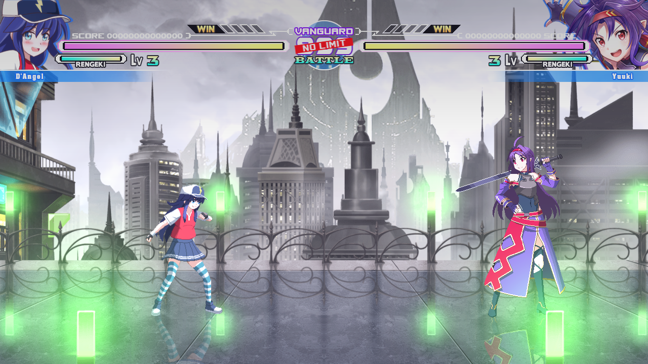
Whats the game source? coz looks nice graphicaly.
-
Or pay more for the graphics part and make it more Arksys style. U know 2D HD with 3D scenery
-
Nice. those sprites make him look like a character that could have being on Waku Waku 7 <3