


.png)


Jho
-
Posts
140 -
Joined
-
Last visited
Posts posted by Jho
-
-
-
Left 4 Dead?

Should have been left for dead
-
Okay so here we have Half Life 2 with Morgan Freeman, and some whore.
Game of the year? I don't know how that happened.
-
This prick Obama, who's running the damn country into the ground with his faggot shit. the shitfoil hat will protect you from his mind rays, if you don't wear it, you'll just become part of the system.
-
There was a time I touched a nurse, she was really black and also a guy who was named Pablo and was ugly as fuck too and he was eating a creamy long chocolate sushi roll filled with thick rich creamy pepperoni fabricated in mother Russia, but seriously Pablo was hilariously drunk as shit the pepperoni was cum and then escaped to kiss my huge butt plug. I like how young boys shake their dicks while they suck Pina Colada's in jail with my little pony. Absolutely the most gay story seen on MFFA Posted by the User. Suddenly porn star woman named Susan broke my Onee-sama's cellphone to kill Tobey Maguire running away from a flying penis Shooting a huge load of mayo and ketchup At a hamburger patty On a woman's back. This thread is bad.
-
Enjoy your stay
-
http://www.youtube.com/watch?v=W-SCAAPSZtU
I'll just add links since this shit is lagging me now.
-
http://www.youtube.com/watch?v=NmOA7bR1f9Q
Gah
-
DOUBLE POST I SAW IT
-
WTF DID I MISS
What the hell is the name of that song played during the first intro,right at the beggining?
Flashback Memory Stick
* Sees Chef Boyardee but sees Mugen Videos Instead * This Nigga can't Cook
Aight look nigga, I've been testing my culinary skills over the past skill, I can cook some darn good meals.
Darn good microwavable pizza.
By microwavable, I mean oven baked.
But I ain't got time for that.
-
With or without squares? I'm stuck with this dilemma
-
Oh please do enjoy your stay.
-
Might work in winmugen, I really don't know since I never used it =/
-
http://www.youtube.com/watch?v=Bgjhb1z64R8
I don't know what I'm doing
-
I find you might enjoy this place more, it's not as active but I'm sure you'll grow attached to it.
-
Nothing really blends
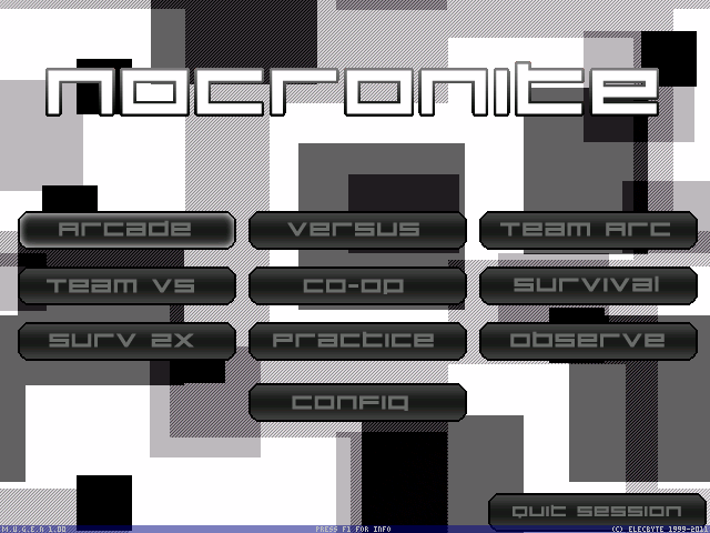
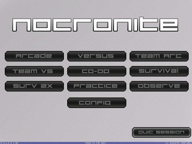
[Title]
- For starters the main font is boring and lacks detail, sure you have a gradient but it's plain, perhaps a border might help a bit.
- Fonts for select look like something that belong in a Mario game and don't really fit the idea of the universe thing, also try something besides green, it doesn't blend well with the rest of the screen.
- Seems like no organization is present. I'd recommend maybe make the title font be centered and then make the rest of the fonts be centered under them? Similar to the way the default 1.0 SP handles it. Or if you prefer having them at the side try a different space image with the galaxy featured to the bottom right so that it covers that empty space left by the fonts.
[select]
- Slots clash but I assume it's the yellow border, go for maybe a plainer gradient silverish border.
- Maybe make the gloss a bit less visible on the 9000,0 boxes? They look nice on the 9000,1 boxes.
- Blank slots, if they had animation they might fit better but for now they don't work too well, again could be the border choice being a bit too clashy for it to work.
- Might be just me but I feel like there's too much going on there but hardly any of it compliments each other, if you're gonna have a busy background go for simple slots, it's easier on the eyes. Your earlier screenpacks for example had very simple slots and such but that was because the background was busy enough to keep it occupied, it's very nice to look at.
[Versus]
- Reserved
[Lifebars]
- Reserved
[Victory]
- Reserved
For music, maybe something like this?
http://www.youtube.com/watch?v=JAP-_-XC9js - DoDonPachi Daifukkatsu Black Label Sally
http://www.youtube.com/watch?v=wI0ekzgXxEk - SFEX3 Character Select
-
http://www.youtube.com/watch?v=-JiI5MTAJwo
Testing out quality and such
-
-
http://www.youtube.com/watch?v=rcdI_eexmaI
-
-
SINCE NOW YOU MOTHERFUCKING SL HLSJF HSLFJ HSFJ<B
:'l.....
-
http://www.youtube.com/watch?v=2kMPhR13f3E
-
now that, sir, was NOT white knighting. don't be harsh unnecessarily.
I don't care
So that screenshot with the IPs... um... the dude needs help.
-
Okay, look.
This has gotten WAY out of hand. This isn't 12 hours old, and we already have a shitstorm on our hands. I had to sit through Laharl, Jay, Diss and GLB go on debates over whether or not Yuyu was a girl, a man, Japanese, Texan, Dead or alive using information that is 2 years old, and that is just plain stupid.
So with this said, why is everyone making assumptions so early in the first place? Does it matter?
If it is false, we will deal with it accordingly. If it is true, we should respect the memory of the departed. Simple at that.
Dumbshit white knight


Your New Admin
in [ STAFF HQ ]
Posted
Aw damn it :/